Shape Pilates
brand identity - web design
THE BRIEF
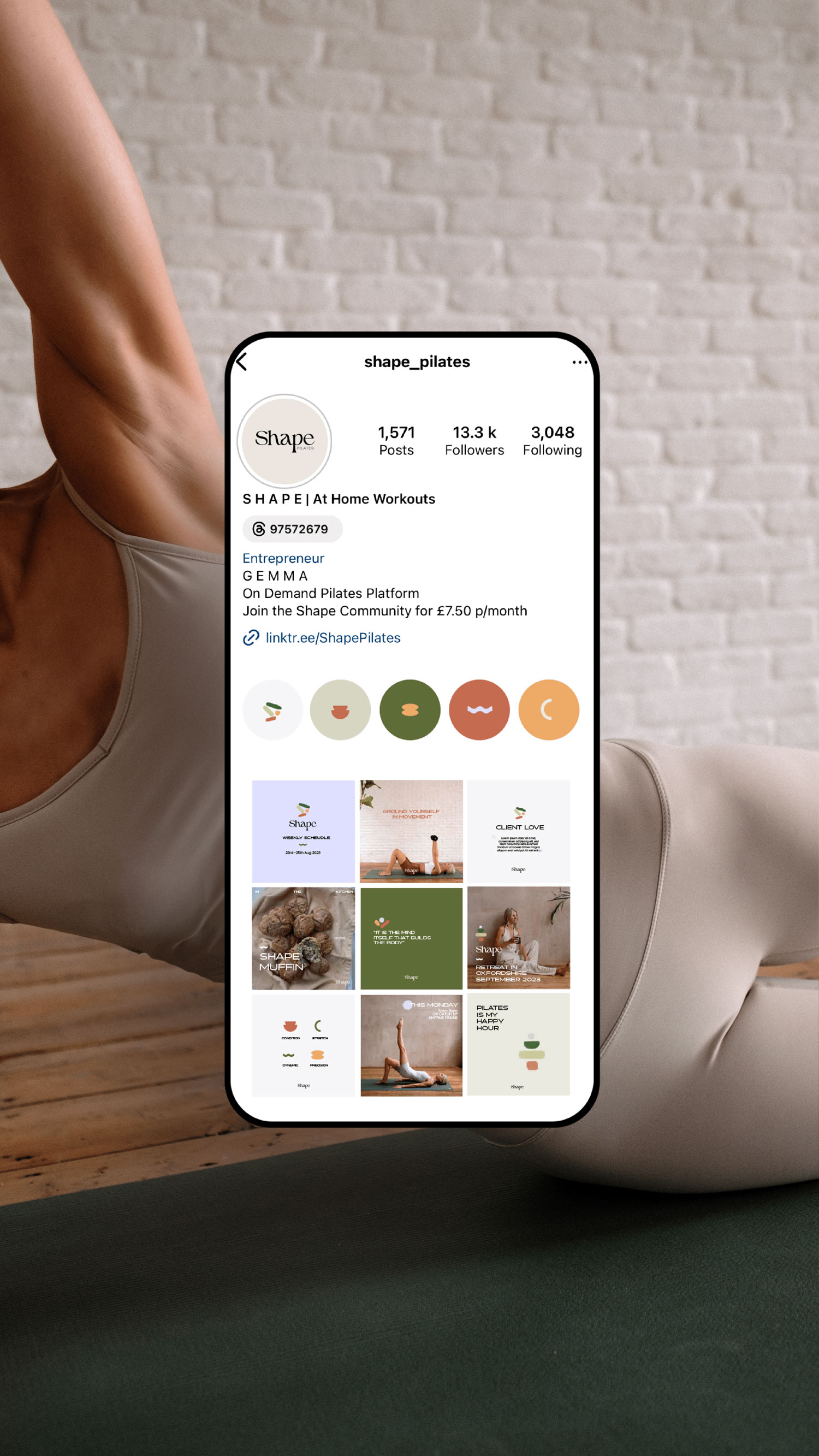
Gemma, founder of Shape Pilates, approached Klioh Studio looking for logo design, colour palette, website design and Instagram templates to grow her business during 2023 and 2024. She was looking to make her existing offering of live classes and over 150 pre-recorded classes personal, welcoming and accessible for everyone.
THE SOLUTION
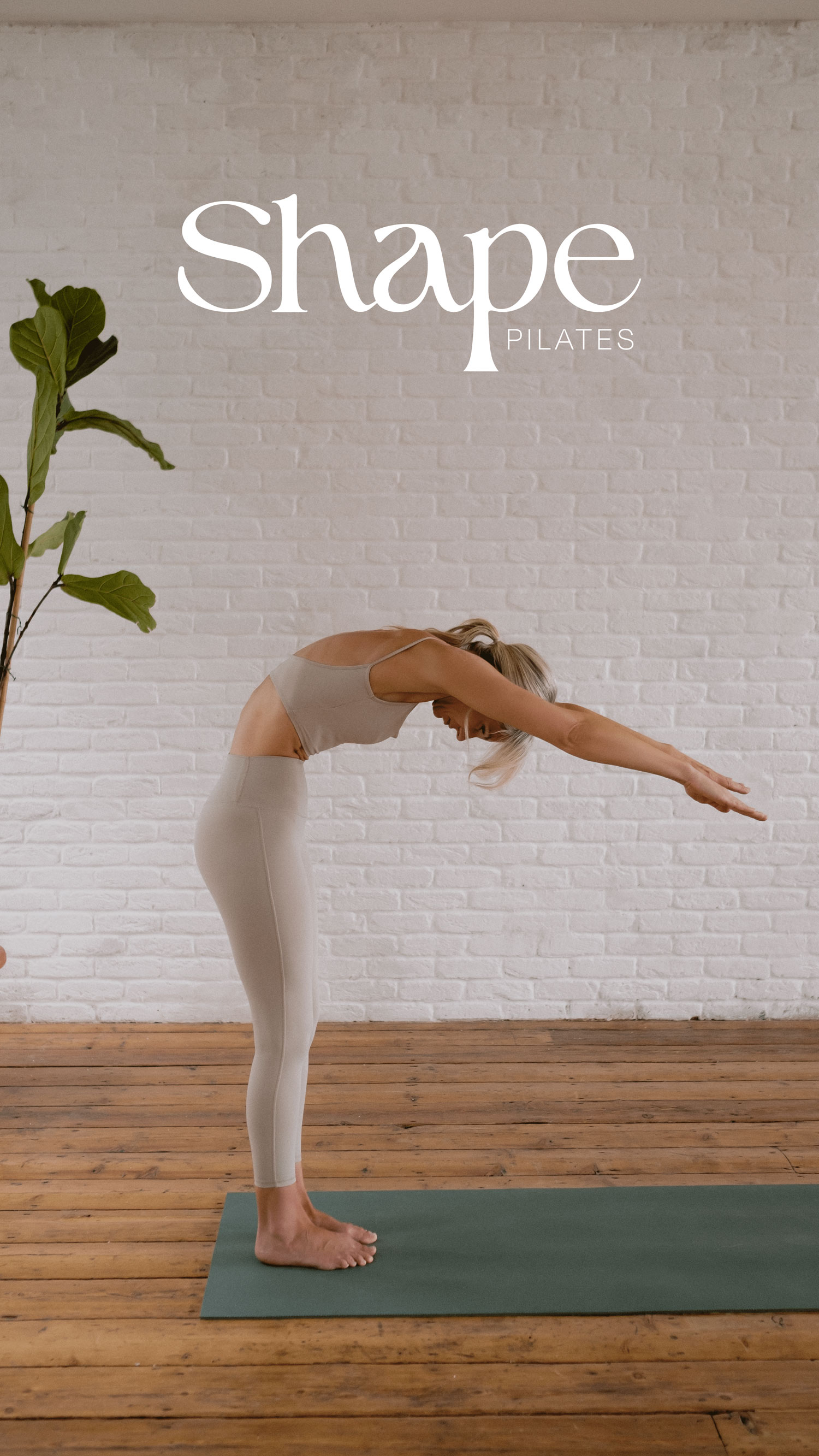
We developed a logo using a curved display typeface with flowing lines and organic shapes. This fluidity evokes a sense of movement, mirroring the natural curves and contours of the human body. It represents the gracefulness and dynamism of human motion - representing pilates. The heading is a wide sans serif typeface which has a contemporary and clean appearance to convey a sense of modernity and minimalism whilst the generous spacing and absence of decorative elements creates a feeling of openness and flexibility. The pairing of a serif font with the sans serif gives a clean and professional result, and the two fonts compliment each other.
THE RESULTS
The name Shape reflects the different shapes a body creates whilst practising pilates and therefore boho style hand-drawn elements were incorporated into the brand identity to give an organic and natural feel. They include flowing lines, whimsical shapes, and botanical motifs, representing a connection to the earth, a love for nature, and a desire for a more organic and free-spirited lifestyle.
Website coming soon…!